Tuesday, 7 May 2013
Saturday, 4 May 2013
Changing the Storyboard.
After beginning my animation I decided that I wasn't happy with the story, and decided to change elements of my story board.
I decided to keep the electricity idea, but to give my animation more of a narrative I wanted to show a change in technology. That's why I decided to use cogs at the beginning and then transform them into the sparks and circuit boards to show a change.
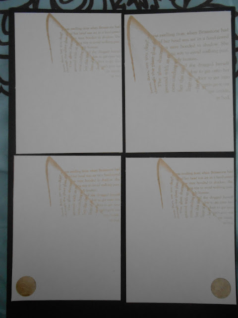
Initial cog drawings:

New Storyboard Development:


I think using hand-drawn techniques will make these elements contrast the clean lines of the 'electricity' section of my animation.


Monday, 29 April 2013
Starting My Animation
Ideas for my animation:
Images of circuit boards and sparks.


Creating the spark using photoshop and after effects:


Animating the circuit board:


Images of circuit boards and sparks.


Creating the spark using photoshop and after effects:


Animating the circuit board:


Tuesday, 23 April 2013
Workshops
I Can Animate
In this workshop we used lego to create a short stop motion film. I enjoyed this workshop however I don't think it would work for my own idea.
After Effects
Getting to grips with After Effects is difficult, but I think it will allow me to create my animation the way I want it to look.
Here is the result of one of the workshops:
What next?
I have downloaded the trial of After Effects so I can start experimenting with the way I want all the different elements to look.
After having these workshops I have started to realise just how much work this is going to be - so I need to start experimenting with my circuit board and spark animation ideas.
Friday, 5 April 2013

Key Frames/ Timings
Initial planning of animation:
(I know it looks rough and sketchy - but I know what it means!)


After figuring out the 'story', and making each section fit with my music I think i'm ready to create my first storyboard draft.
(I know it looks rough and sketchy - but I know what it means!)
After figuring out the 'story', and making each section fit with my music I think i'm ready to create my first storyboard draft.
Sketches
Here are a few sketches of the ideas i had for my animation -


I decided to focus more on circuit boards than the way electricity moves - because this could have more of a narrative. But I will still think about the jagged shapes from the videos of electricity when creating the 'spark'.


I decided to focus more on circuit boards than the way electricity moves - because this could have more of a narrative. But I will still think about the jagged shapes from the videos of electricity when creating the 'spark'.
Wednesday, 27 March 2013
Electricity
After looking at the mood board I created, I have decided to focus on 'Electricity'.
To start I decided to just put down some of my ideas on paper:

To start I decided to just put down some of my ideas on paper:
The main idea I came up with was looking at the way electricity moves, since I think this would work with my music.
To look at how electricity travels I went to youtube to see if there were any videos.
I think this spiky, jagged movement might work with my music.
I could also look at circuit boards etc.
I think the next thing I need to do is come up with a narrative.. does this electricity lead to anything happening? ...
Thursday, 21 March 2013
Animation Research
There are lots of different types of animation, and although I don't have a direction for my own yet I thought it would be a good idea to look at other peoples to get an idea of what's possible :)

Mind Map
I decided to look at 4 words in particular:

- Metallic
- Electricity
- Static
- Industry
I mind mapped these words to hopefully give me some more ideas for my animation.

Monday, 18 March 2013
Initial Thoughts.
I have been finding it really hard to start this project, because I really don't like the track I have been given. But when I sat down and listened to it I managed to think of three words:
- Metallic
- Electricity
- Static
I then decided it might be good to ask other peoples opinions of the track, and their responses were interesting:
- Noise
- Electricity
- Rubbish
- Industry
- Pollution
I plan to explore these words further, and hopefully this might give me more direction for my animation.
Print To Pixel
Brief: We have been allocated a piece of music, from which we have to make a 20-30 second animation based on our emotional responses.
This is my piece of music:
It was released in 2002 by Autechre, and the video was made by Alex Rutterford (a british graphic designer)
To inform the direction my animation will go in I need to think of 3 words that the music makes me think of and explore these further.
Sunday, 3 March 2013
Finally Finished!
Although I'm happy to have finished my design, I am not 100% happy with it. I feel like it looks more like a prototype than a polished piece of packaging.


There are a lot of things I would change:
Having printed the image onto the net before laser cutting,
Having all parts of the net in one piece instead of having to stick certain parts together,
Looking more at size (working harder on making it smaller),
Being more careful with my laser cut type (as these bent),
However, it's not all bad. I am still happy with the concept, and I just wish I had more time to go back and make improvements.
But here it is:


Inside my packaging
After finishing the exterior of my packaging I decided to look at the inside.
One of my key pieces of information was that I liked using charcoal so I decided to work in this way, but I also felt my design needed some colour- so I looked at using chalk as well to make it more visually interesting (and to show that I don't just like black and white)
This is my original drawing:
 I wanted it to look cartoon-ish so I drew it in a sketchy style not being too precious with the lines, but the colours didn't look very vibrant, so I edited this on photoshop, printed it and used it within my packaging.
One of my key pieces of information was that I liked using charcoal so I decided to work in this way, but I also felt my design needed some colour- so I looked at using chalk as well to make it more visually interesting (and to show that I don't just like black and white)
This is my original drawing:

Wednesday, 13 February 2013
More Laser Cutting
After putting together my net I decided that the front cover needed something as it looked very plain, so I decided to do more experimentation with etching. Last time I etched the 'page' photo I did it on a small scale so it was hard to read. But this time I made it larger and I think it looked good as you could read the words. I decided to use this in my final package.
I then looked at adding the logo to the front:

After looking at the size of the 'page' photo and the placement of the logo I have decided to use the bottom right image.
No more laser cutting, yay!
Tuesday, 12 February 2013
Laser Cutter
Using the laser cutter is stressful.
The first problem I encountered was the type. Because my image was not very high quality and pixilated, I struggled to get the lines. So it took 2 hours to create the lines for the text.
It was also very slow to etch the lines, so it started to drive me insane by the end. However, I did get the nets cut, as well as the type (despite them being fragile).
The box fit together, and the type fit inside (although on this example the words are broken)

I also looked at size, and tried creating a really small box. However, the letters were too small for the laser to cut so it was not successful.
I then looked at creating a large box, the letters worked, butI preferred the smaller idea.
I also tried different types of paper, but I decided that the slightly marbled white paper looked the best.
I looked at etching - both with an image of a folded over book and my logo, and I tried small testers of each (in my sketchbook)

I didn't like the effect of the etched book because they didn't really look like words, they just looked like squiggles.
I did however decide to etch my logo onto the side of my box.
Now that I have cut out the nets, I just need to complete the illustrative portion of my packaging.
Paper

I have bought lots of different types of paper to try out on the laser cutter to see what works best :)
Too Much Type?
Because of my final design being a book, I think that my design has gone down a very typographic route. But this isn't the only area of design I like and I don't think it shows 'me as a designer', so I have decided to still use the type that I created, but only have 2 layers of words instead of 4, and do some sort of illustrative image behind them. This will act as more of my 'key pieces of information'.
I will still use the laser cutter for my nets and for the type, but I want to include drawings as well.
I will still use the laser cutter for my nets and for the type, but I want to include drawings as well.
Hand Drawn Type
I decided to create my own type, and after narrowing it down to two ideas, I scanned them in to see what they would look like digitally.
 I think that these designs look a bit messy, but as they are being cut out I think they may look effective.
I then decided to look at the flatter/ longer type and ignore the 'loopy' idea.
At this point I realised that for my design I needed a black outline (that the laser cutter would cut) and a white centre, which would remain.


I then decided to look at the flatter/ longer type and ignore the 'loopy' idea.
At this point I realised that for my design I needed a black outline (that the laser cutter would cut) and a white centre, which would remain.

I added a black outline and filled the letters white.I will try and cut these shapes on the laser cutter soon.
Subscribe to:
Posts (Atom)